Japanese automaker Mazda presented new logo. The company developed the new icon after it decided to enter the market of more luxurious cars.
This information was reported by Car and Driver, reports “URA-Inform”.
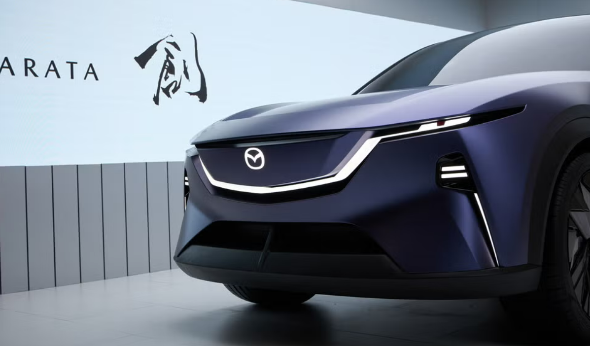
It is noted , that the updated logo has changed visually only slightly. It still has the shape of an oval, in which the letter M is inscribed, stylized as two spread wings.
However, the outer ring is now more rounded compared to the previous version. The wings, on the contrary, have received pronounced angle and became less smooth. In addition, the nameplate with this logo became flat. It no longer has volume and does not protrude above the surface of the body.
The carmaker has already submitted all the necessary documents for registration of the new trademark. Experts suggest that the updated logo may be exclusive to China, where Mazda has a joint venture with Chinese automaker Changan.
However, the publication noted that the Japanese concern is expected to carry out a global rebranding, the key element of which will be a change of logo. The current Mazda's logo has been around since 1997, when the brand moved away from the 1990s style of a circle inside an oval.

Recall that it was previously reported why the Great Sphinx has no nose.
