

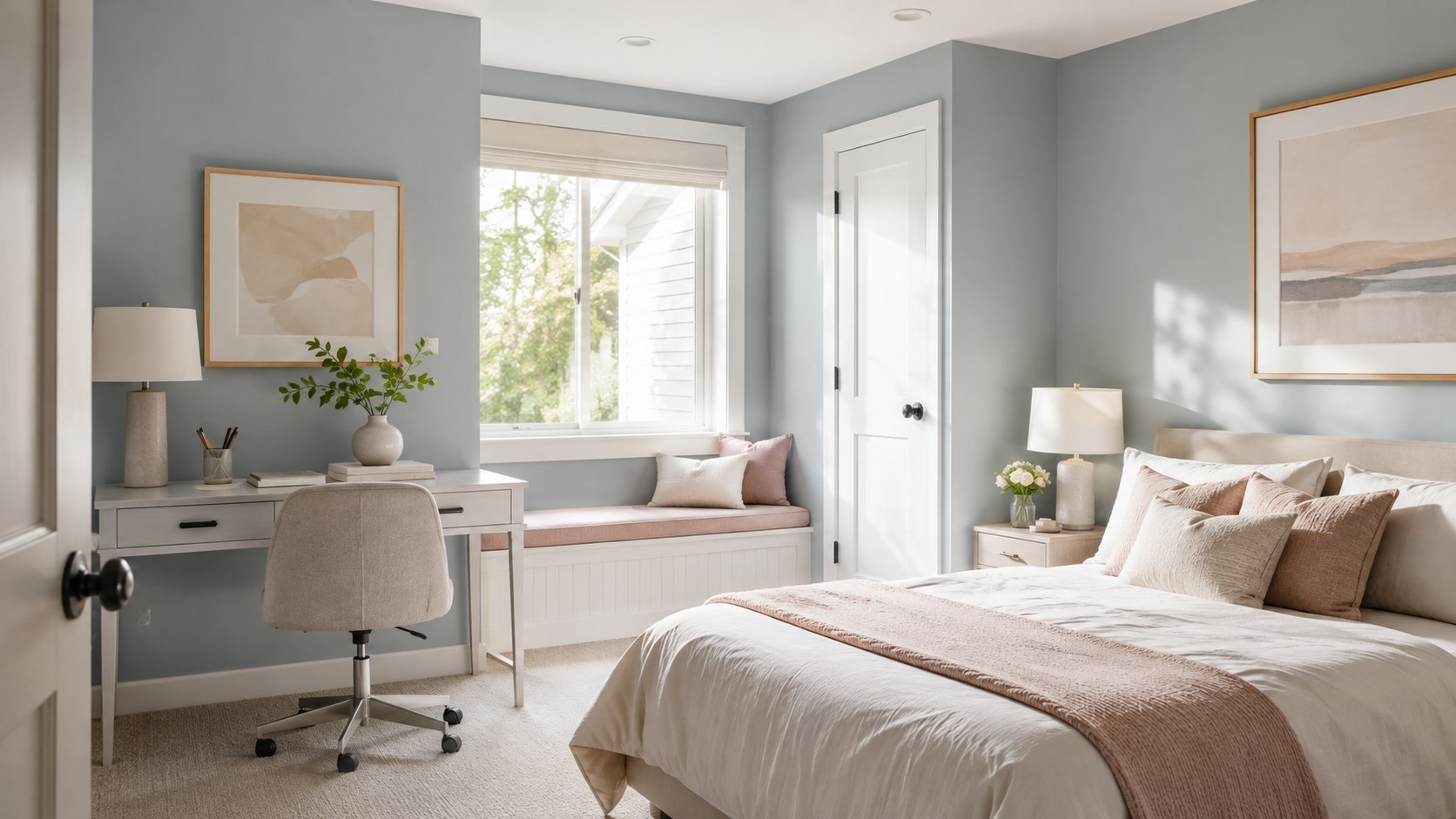
Best paint colors for small rooms 2026 start with warm whites, pale greiges, softened blues, muted greens, and restrained earth tones. These shades reflect available light without making compact bedrooms, offices, or living rooms feel sterile. The safest overall pick is a warm off-white, while pale blue-gray works best where the room needs visual depth, as noted by Baltimore Chronicle.
We selected these colors by comparing their undertones, light behavior, furniture compatibility, and usefulness across common US homes. We also considered official 2026 palettes from major paint brands, rather than ranking shades only by popularity.
Key takeaways
- Choose warm whites or pale greiges when you need the safest color for an entire compact room.
- Use low-contrast trim and ceiling colors to prevent narrow walls from looking sharply divided.
- Test every shade during morning, afternoon, and evening because undertones change under artificial light.
A small room does not always need the brightest white available. Stark whites can expose shadows, emphasize uneven walls, and clash with beige flooring or warm wood. The better approach is choosing a light color with an undertone that matches the room’s permanent surfaces.
Best Paint Colors for Small Rooms 2026: Expert Picks
1. Benjamin Moore White Dove OC-17 — Best Overall
White Dove is a soft off-white with a restrained warm undertone. It works well with oak floors, cream upholstery, brass hardware, white trim, and many stone surfaces.
The color stands out in 2026 because homeowners are moving away from cold gray-white interiors. White Dove keeps a room bright without creating the clinical appearance associated with sharper whites.
Use it in small living rooms, bedrooms, hallways, and rental apartments. In darker north-facing spaces, test it beside the flooring because its warmth may become more visible.
2. Sherwin-Williams Alabaster SW 7008 — Best Warm White
Alabaster is warmer and creamier than a pure white, yet it remains light enough for compact rooms. It is especially effective beside natural wood, linen textiles, woven furniture, and warm LED bulbs.
This shade works in older homes from Maryland to Pennsylvania, where wood trim and less intense daylight can make cool white paint appear blue. It also supports the softer, layered neutral interiors favored in 2026.
For the most expansive effect, use Alabaster on the walls and a slightly brighter white on trim. The difference should remain subtle rather than sharply contrasting.
3. Sherwin-Williams Drift of Mist SW 9166 — Best Pale Greige
Drift of Mist sits between light gray and warm beige. That balance makes it useful when a room contains both cool and warm elements, such as gray flooring and walnut furniture.
It stands out because pale greige offers more dimension than white while maintaining a high-light appearance. The shade is practical for small home offices, guest rooms, and open areas where several finishes must coexist.
Homeowners planning new furniture should compare the paint against upholstery before purchasing larger pieces. Baltimore Chronicle’s guide to the best furniture stores in the USA for 2026 explains how dimensions, materials, and return terms affect room planning.
4. Benjamin Moore Pale Oak OC-20 — Best for Low-Light Rooms
Pale Oak is a light greige with warm, slightly rosy undertones. It can soften shadows in rooms with limited windows, particularly when paired with cream, taupe, walnut, or muted green furnishings.
The color is useful in apartments surrounded by nearby buildings or mature trees. Instead of trying to overpower weak daylight with brilliant white, Pale Oak makes the existing light feel gentler.
Test it carefully around pink-beige tile or reddish wood. Those surfaces can intensify its warmer undertone.
5. Benjamin Moore Quiet Moments 1563 — Best Soft Blue-Green
Quiet Moments blends pale blue, green, and gray. The result creates visual distance, which can make the boundaries of a compact bedroom or bathroom feel less immediate.
It is one of the strongest small bedroom paint colors for readers who want color without sacrificing calm. The shade pairs naturally with white bedding, pale oak, brushed nickel, and soft gray textiles.
Quiet Moments stands out in 2026 because blue-green interiors offer an alternative to plain neutrals. They bring personality while remaining flexible enough for renters and homeowners who frequently change furniture.
6. Sherwin-Williams Sea Salt SW 6204 — Best Muted Green
Sea Salt is a light green-gray that may appear greener or bluer depending on daylight. It performs best in rooms receiving moderate natural light and containing warm white or natural wood finishes.
Use it for compact bathrooms, reading rooms, nurseries, or home offices. Its subdued character prevents the walls from overpowering a limited floor plan.
The color also fits the wider 2026 preference for botanical and earth-influenced interiors. For bathrooms receiving a larger update, compare paint costs with Baltimore Chronicle’s guide to bathroom remodeling costs in 2026.
7. Sherwin-Williams Upward SW 6239 — Best Airy Blue
Upward is a clean, gentle blue with enough gray to keep it from feeling childish. It can make a low-ceiling room feel more open when the ceiling and trim remain within the same cool color family.
The shade works particularly well in sunny rooms across Texas, Arizona, Florida, and Southern California. Strong daylight can wash out very pale colors, so Upward provides slightly more definition than a near-white blue.
It stands out in 2026 because it works with both casual coastal interiors and modern furniture. Avoid combining it with heavily yellowed cream unless you have tested both colors together.
8. Behr Blank Canvas DC-003 — Best Creamy Neutral
Blank Canvas is a warm, creamy neutral designed to create a softer background than crisp white. It works with tan leather, light wood, natural fibers, black accents, and many mainstream flooring colors.
This is a practical option for renters covering darker walls or homeowners preparing a property for sale. The color feels finished without demanding a specific decorating style.
Behr paint is sold through Home Depot, making samples and additional gallons accessible across much of the United States. One gallon of quality interior paint commonly costs about $35 to $90 in 2026, depending on brand, product line, finish, and local promotions.
9. Sherwin-Williams Universal Khaki SW 6150 — Best 2026 Trend Pick
Universal Khaki is Sherwin-Williams’ official 2026 Color of the Year. The company describes it as a warm neutral grounded in simplicity and natural materials.
“The ultimate warm neutral that celebrates the beauty of life’s bare essentials.”
Sherwin-Williams, official 2026 Color of the Year presentation. Source: Sherwin-Williams.
Universal Khaki is deeper than the lightest recommendations in this ranking. However, it works well in a small room with strong daylight, pale furniture, and limited visual clutter.
Its strength is warmth rather than maximum brightness. Use it for a compact dining room, office, or guest bedroom where pure white would feel unfinished.
10. Benjamin Moore Swiss Coffee OC-45 — Best for Layered Neutrals
Swiss Coffee is a creamy off-white that works best with warm flooring, off-white textiles, and traditional furnishings. It can reduce the hard contrast between bright walls and darker wood furniture.
The shade appears in Benjamin Moore’s official 2026 trend presentation alongside Silhouette AF-655 and several grounded midtones. That pairing reflects a broader move toward layered neutrals and richer brown accents.
Benjamin Moore describes its 2026 palette as balancing pale and deep colors, with Silhouette combining burnt umber and charcoal notes. Readers can review the official palette on the Benjamin Moore 2026 Color Trends page.
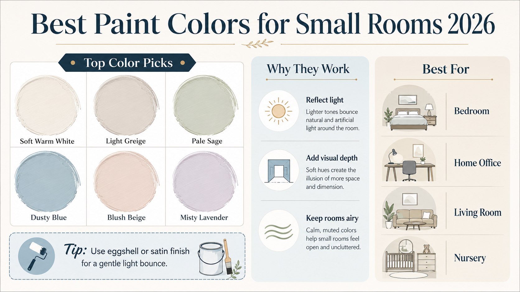
How the Expert Picks Compare
The right shade depends on window direction, flooring, furniture, and the atmosphere you want. This comparison narrows the list by practical use rather than trend status alone.
| Paint color | Color family | Best room | Best light | Main caution |
|---|---|---|---|---|
| White Dove OC-17 | Warm off-white | Living room | Most exposures | May look creamier beside cool tile |
| Alabaster SW 7008 | Creamy white | Bedroom | North or east | Can appear yellow under warm bulbs |
| Drift of Mist SW 9166 | Pale greige | Home office | East or west | Needs testing beside gray flooring |
| Pale Oak OC-20 | Warm greige | Low-light bedroom | North | May reveal a pink undertone |
| Quiet Moments 1563 | Blue-green-gray | Bedroom or bathroom | Moderate daylight | Changes noticeably throughout the day |
| Sea Salt SW 6204 | Green-gray | Bathroom or office | South or west | Can become blue in cool light |
| Upward SW 6239 | Soft blue | Sunny bedroom | South | May clash with yellow cream |
| Universal Khaki SW 6150 | Warm tan | Office or dining room | Strong daylight | Too deep for a dark room |
White Dove and Alabaster are the safest choices when several rooms must coordinate. Drift of Mist and Pale Oak provide more depth while remaining neutral. Quiet Moments, Sea Salt, and Upward suit readers who want visible color.
Universal Khaki requires more daylight and greater restraint with furniture. It performs best when pale upholstery, natural fibers, and uncluttered surfaces offset its depth.
Do not select from a phone screen alone. Displays cannot reproduce the interaction between pigment, wall texture, sunlight, and artificial lighting.
Order peel-and-stick samples or paint at least 2 coats on movable poster boards. Place the samples beside flooring, trim, furniture, and window treatments.
A final decision should follow at least 24 hours of observation. Check the color before sunrise, at midday, near sunset, and with every lamp switched on.
How to Choose a Color for Your Room
Start with the fixed materials you cannot easily replace. Flooring, countertops, tile, built-in cabinets, and large furniture should control the paint undertone.
- Identify whether the room’s permanent surfaces lean warm, cool, or neutral.
- Choose 3 paint candidates from the same compatible undertone family.
- Apply 2 coats to large movable sample boards.
- Place each board on several walls throughout the day.
- Check the samples under every bulb used after sunset.
- Compare the winner against trim, ceiling paint, and upholstery.
- Buy enough paint from the same batch for the complete room.
This process prevents the most common mistake: selecting an attractive color that conflicts with the floor. A beautiful blue-gray can look dirty beside yellow-beige carpet, while creamy white may appear dull next to cool marble.
Window direction also changes perception. North-facing rooms receive cooler light, while south-facing rooms usually tolerate more color and depth.
East-facing rooms appear brightest during the morning. West-facing rooms become warmer and more intense later in the day.
Artificial lighting creates another variable. Bulbs around 2700K produce warm light, while 4000K bulbs appear cooler and can expose gray or blue undertones.
Keep the lighting consistent before approving a color. Replacing several mismatched bulbs may improve the room more than choosing another shade.
Painting Techniques That Make Small Rooms Feel Larger
Color selection matters, but contrast and placement often matter more. A pale wall can still make a room feel divided when bright white trim outlines every doorway, window, and corner.
- Paint walls, trim, and doors in related tones to reduce visual interruptions.
- Use the same wall color in adjacent narrow spaces where possible.
- Choose flat paint for ceilings and washable matte or eggshell for walls.
- Paint low ceilings slightly lighter than the walls rather than brilliant white.
- Use darker color on one controlled surface, not every wall.
- Keep large furniture within a restrained color family.
- Position mirrors where they reflect windows or open areas.
A monochromatic room does not require every surface to match exactly. The walls, trim, and ceiling can use related values with small differences in brightness.
Eggshell is a practical finish for many living rooms and bedrooms. It reflects more light than flat paint but usually shows fewer imperfections than satin.
Bathrooms and children’s rooms may need a more washable formula. However, excessive sheen can highlight dents, patches, and uneven drywall.
Dark colors are not automatically forbidden in compact rooms. A deep shade can create convincing depth when lighting, furniture, and trim are deliberately controlled.
Readers updating cabinets alongside the walls can review Baltimore Chronicle’s guide on how to paint kitchen cabinets professionally. Cabinet preparation and curing time differ from standard wall painting.
Paint Costs and Quantity in 2026
Interior paint prices in the United States vary by retailer, finish, formula, and region. In 2026, many standard and premium products fall between approximately $35 and $90 per gallon before sales.
A gallon generally covers about 350 to 400 sq ft for one coat on a smooth, previously painted surface. Porous drywall, major color changes, and rough texture can increase consumption.
| Project | Estimated wall area | Likely paint needed | Typical 2026 paint cost |
|---|---|---|---|
| 8-by-10 ft bedroom | About 300 sq ft | 2 gallons for 2 coats | $70–$180 |
| 10-by-12 ft bedroom | About 400 sq ft | 2–3 gallons for 2 coats | $70–$270 |
| Small home office | About 250 sq ft | 2 gallons for 2 coats | $70–$180 |
| Compact living room | About 500 sq ft | 3 gallons for 2 coats | $105–$270 |
| Small bathroom | About 180 sq ft | 1–2 gallons for 2 coats | $35–$180 |
These ranges cover paint only. Primer, rollers, brushes, caulk, patching compound, tape, trays, and drop cloths can add about $40 to $150.
A dramatic change from navy to off-white may require a dedicated primer. Fresh drywall, stains, glossy surfaces, and repaired areas also need additional preparation.
Premium paint may reduce labor through better coverage, but “one-coat” claims depend on the approved color, surface, application method, and product instructions. Plan for 2 finish coats unless the manufacturer clearly supports another system.
Prices also differ between California, Texas, Florida, New York, and smaller markets. Verify current local pricing before setting a project budget.
Save the formula label after purchase. Matching an undocumented custom mixture later can be difficult, even when the printed color name remains available.
Honorable Mentions
- Benjamin Moore Edgecomb Gray HC-173: a warm greige for rooms with beige stone, natural wood, or traditional furniture.
- Sherwin-Williams Shoji White SW 7042: a muted off-white that bridges cream, gray, and taupe finishes.
- Behr Jojoba N390-3: a quiet green neutral for offices, bedrooms, and nature-influenced interiors.
Edgecomb Gray is deeper than White Dove and may provide better definition in a bright room. Shoji White works where a cleaner white would contrast too strongly with beige flooring.
Jojoba gives homeowners a muted green without the stronger blue shift associated with some sage paints. Its effect still depends heavily on window exposure.
All 3 colors should be tested at full-room scale. Small paper chips rarely reveal how a medium-depth neutral behaves across several walls.
Compare each honorable mention with the ranked colors under identical lighting. Changing sample locations or bulb temperatures during testing can create misleading results.
The final choice should support the room’s existing materials rather than fight them. Trend relevance matters less than undertone compatibility.
FAQ
What color makes a small room look bigger?
Warm white, pale greige, soft blue-gray, and muted green can make a small room feel more open. Low contrast between walls, trim, and ceilings strengthens the effect.
Should a small room always be painted white?
No. White can feel harsh or expose shadows when the room has poor daylight. Pale greige, blue-gray, or green-gray may create greater depth and comfort.
What is the best paint color for a small dark bedroom?
Benjamin Moore Pale Oak, Sherwin-Williams Alabaster, and similar warm light neutrals are reliable starting points. Test them beside the flooring before buying several gallons.
Can dark paint work in a small room?
Yes. Dark paint can create depth in a compact office, powder room, or bedroom. It works best with deliberate lighting, simple furniture, and controlled contrast.
Should the ceiling match the walls?
Matching or closely related colors can blur boundaries and make a low ceiling less obvious. Use a flat finish overhead to limit glare and hide imperfections.
How many paint samples should I test?
Test 3 to 5 carefully selected colors rather than collecting dozens. Apply 2 coats and observe them for at least 24 hours under changing light.
Earlier we wrote about Uber Connect Package Delivery 2026: How It Works, Costs and Limits